Your Custom Text Here
Overview
Project Details
Team: Katie Huang & Jonathan Narvaez
My Roles: Project Management, Wireframing, Prototyping, User Testing
Platform: Tablet
Story
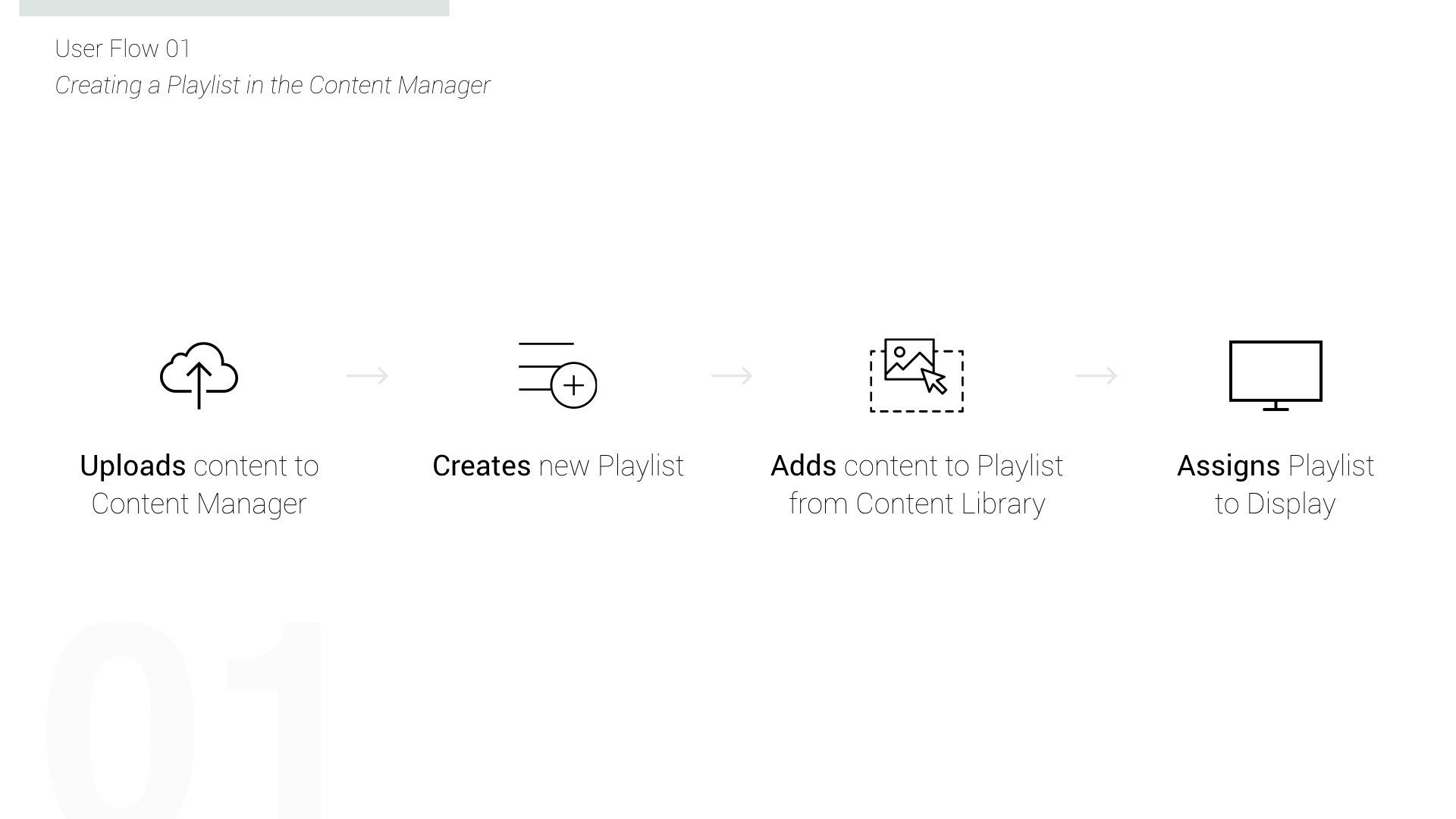
Virtuoso is a web-based content management system used for maintaining creative content across multiple Internet of Things devices.
Tools
Sketch, Photoshop, Illustrator, Marvel App, White Board, Pen and Paper, UserTesting.com, Keynotopia
solution
Creating an easy-to-use admin interface for the technology will allow any user to give intelligence to content on outdoor screens.
Problem
The existing prototype needed an interface and dashboard.
Discovery
Stakeholder Interviews | Market Research | User Interviews | Survey

Stakeholder interviews
To better understand what the landscape, mvp as different views, grid and list. and grouping screens.
We kicked off the project by conducting and interview with the Co-founder and CEO/CTO of Nifty. We were able to define the project scope.
We started the research process by conducting and interview and product demo of the existing product with the Co-founder and CEO/CTO of Nifty. During the interview we were able to define the project goals.
Insights
We were able to define the project goals.
OVERVIEW
We kicked off the research process with an interview and demonstration of the early prototype with David Chiu, Co-Founder and CEO/CTO of Nifty.
INSIGHTS
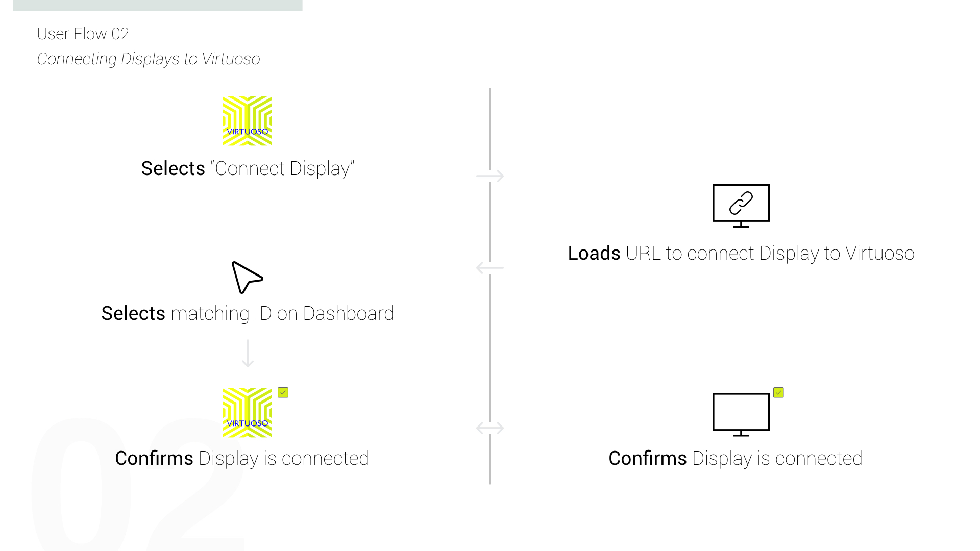
- Virtuoso offers users the ability to dynamically orchestrate content both programmatically and in real-time.
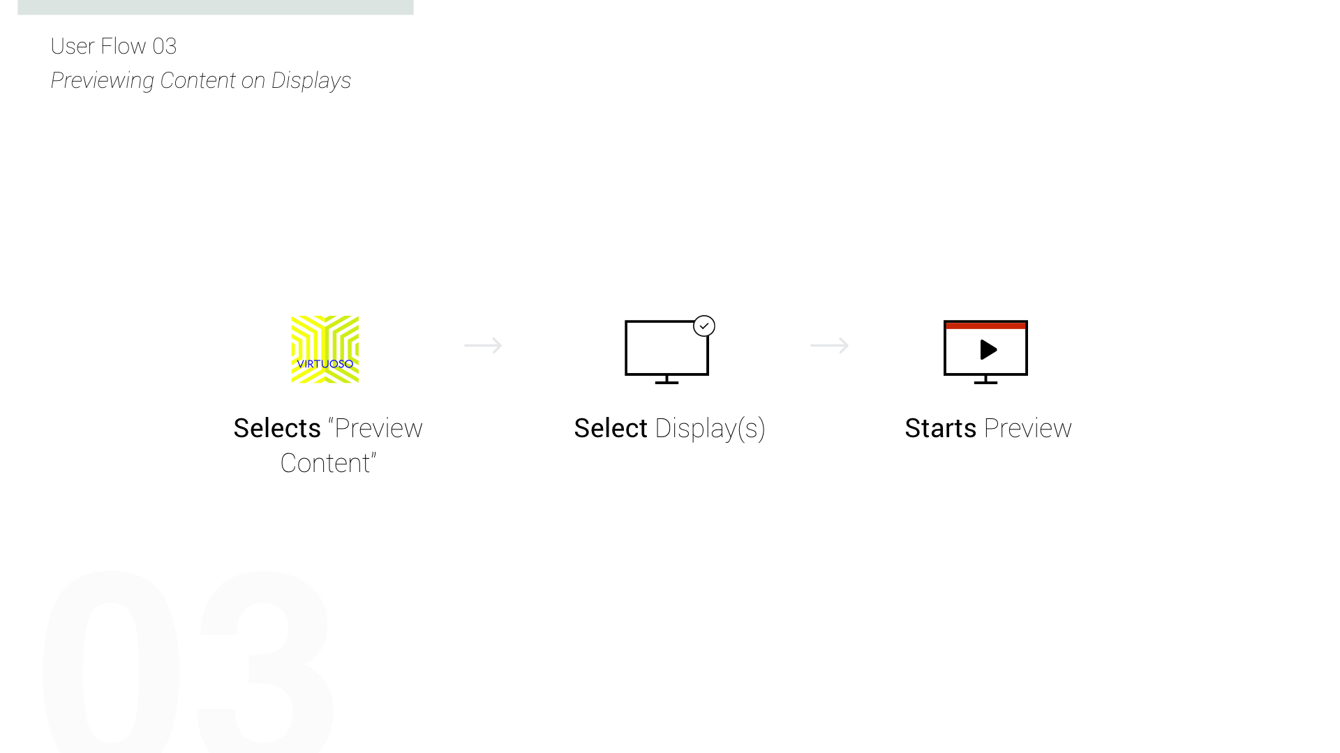
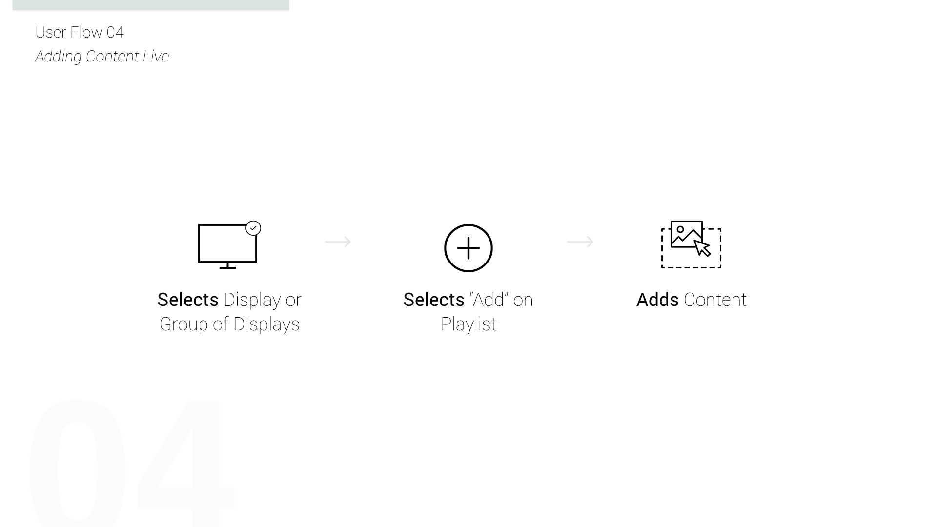
- The MVP feature set includes an admin dashboard that has the ability to connect displays, check current content, add or edit content queues, and preview content on the displays.
market research
We inspected the current landscape of companies offering digital signage.

User Interviews & Survey
We conducted informal in-person user interviews to gather qualitative data about people's overall experience with map apps. We also sent out a survey to gather both qualitative and quantitive data to better understand our users likes and dislikes about navigational map apps. Link to Survey.
Google Forms Survey

Findings
insights
After user surveys via Google Forms, we found out that users did not want to keep re-entering destinations while on-the-go. They also wanted to sync their calendar events from their preferred calendar app with Google Maps.
Define
User Personas | Journey Map | User Flows

user Personas
After user interviews and surveys, we created a user persona to consolidate the information and better understand our target users. Below is a partial summary of our primary user persona.

journey map
We created a User Story to gain insight on our user's usage of the added feature, and it helped informed the user's flow.

user flows
Learning that our users will be using Google Maps Multi-Stop feature throughout their day, it was more helpful to map out the User Journey.
Design
Design Studio | Sketching | Wireframing

design studio
All team members were involved in the ideation process. Through collaboration we were able to incorporate the best ideas. Lots of sketches were done on both paper and whiteboard.

Sketching
Using the whiteboard, we roughly sketched the wireflow. This helped us refine the user flow.
wireframes
Because the new features are updates to the current Google Maps app, we needed to keep the design consistent with the existing UI in ways that enhanced the app without creating unnecessary clutter.

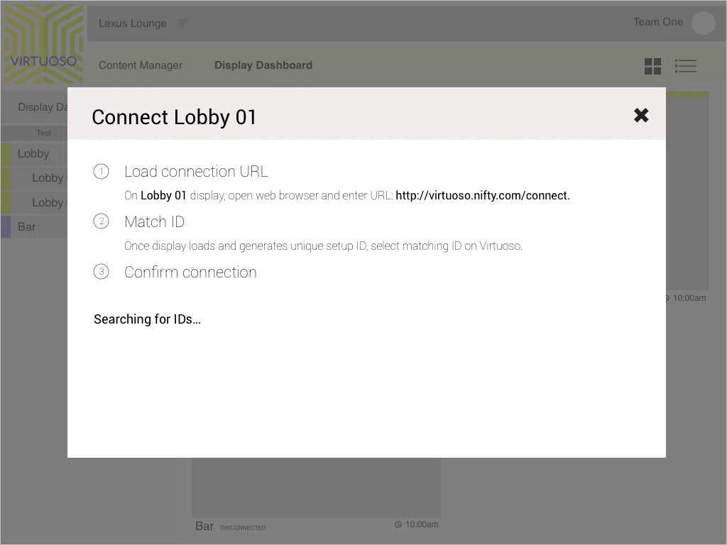


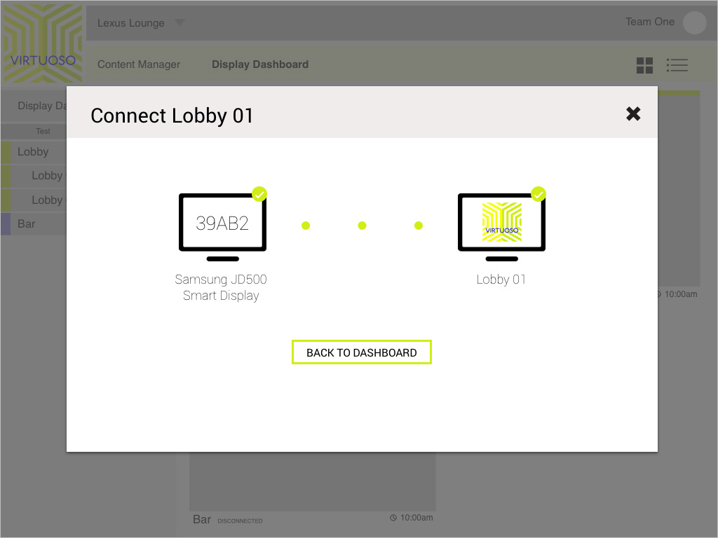

Connecting screens
Testing
Usability Test | Prototype

Usability Test
We combined the initial UI mock up with the wireframe designs that display the new features, and did early user testing to validate the ideas. Using agile UX methods such as rapid prototyping allowed us to iterate early and often.
insights
User testing the hi-fi wireframe revealed that the colors of the destination pins caused a bit of confusion. Having the colors red and green confused the user to think that the green pin meant start point while the red pin meant the end point. Through testing the med-fi wireframe, we found that users were confused with the "by 9:45am," unsure if that meant to leave by or arrive by.
Prototype
In this prototype, the user is going to review her day's itinerary that is synced with her calendar events. She then will add a new destination point and re-order the destination to her preference before she starts navigating.
sdskjdaljds
sdasfasfdsfds
View more projects...