Your Custom Text Here
Overview
Project Details
Team: Dominic Camozzi & Sage Molotov
My Roles: Project Management, UI Design, Prototyping, User Testing
Platform: Mobile
Story
As people's lives become more complex every day traveling to and from various locations within metropolitan cities, commuters need a smarter system that will help them prioritize where they need to go and when.
Tools
Keynote, Sketch, Photoshop, Marvel App, Principle, White Board, Pen and Paper

solution
We added features to allow users to add multiple stops in their day’s journey, as well as re-order and remove multiple destinations. We also designed the ability to sync calendar events from any calendar app to Google Maps.
Problem
The current Google Maps Mobile App gives the user the option of traveling from point A to point B, as well as adding a stop to their current navigation, but does not allow the users to add multiple stops to their journey.
Discovery
Competitive Analysis | Ideation | User Interviews | Survey

Competitive Analysis
To better understand what the landscape was for navigational map apps, we conducted a comparative and competitive analysis to see different features offered on various apps.

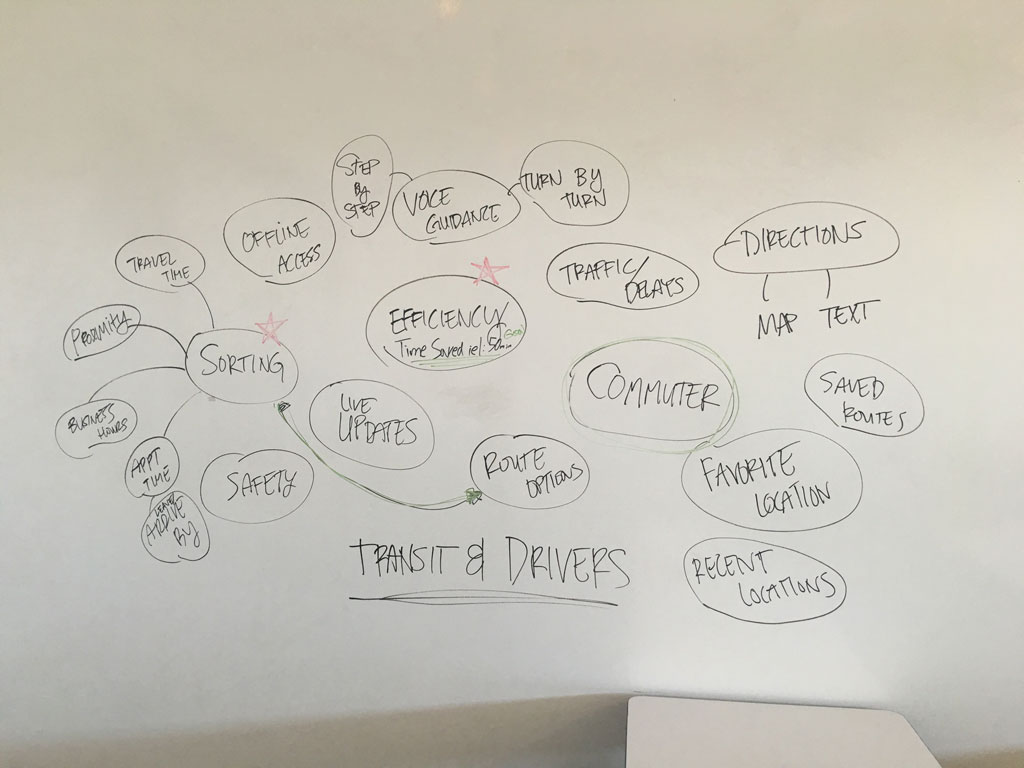
feature prioritization
We used feature prioritization and an affinity map to brainstorm potential features.

User Interviews & Survey
We conducted informal in-person user interviews to gather qualitative data about people's overall experience with map apps. We also sent out a survey to gather both qualitative and quantitive data to better understand our users likes and dislikes about navigational map apps. Link to Survey.
Google Forms Survey

Findings

insights
After user surveys via Google Forms, we found out that users did not want to keep re-entering destinations while on-the-go. They also wanted to sync their calendar events from their preferred calendar app with Google Maps.
Define
Persona | User Story | User Flow | User Journey

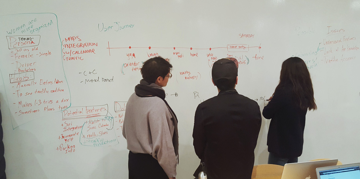
Persona
After user interviews and surveys, we created a user persona to consolidate the information and better understand our target users. Below is a partial summary of our primary user persona.

User Story | User Flow
We created a User Story to gain insight on our user's usage of the added feature and it helped informed the user's flow.

User Journey
After learning that our users will be using Google Maps Multi-Stop feature throughout their day, we mapped out a User Journey to represent the scenarios in which our user might interact with the app.

Design
Ideation | Sketching | Wireflow

ideation
All team members were involved in the ideation process. Through collaboration, we were able to incorporate the best ideas. Many sketches were done on both paper and whiteboard.
Sketching
Using the whiteboard, we roughly sketched the wireflow. This helped us refine the user flow.
User Interface
Because the new features are updates to the current Google Maps app, we needed to keep the design consistent with the existing UI in ways that enhanced the app without creating unnecessary clutter.
Testing
Paper Prototype | Usability Test | Prototype

Paper Prototyping
We applied the lean UX process in the early concept stages and tested the paper-wireflow prototype. This helped validate the user journey.
Sketch showcasing the linear navigation of multiple calendar event destinations.
Sketch of the real-time traffic alert on the home screen.
First iteration of the navigation map once a user completed the first destination.
Usability Test
We combined the initial UI mock up with the wireframe designs that display the new features and did early user testing to validate the ideas. Using agile UX methods such as rapid prototyping allowed us to iterate early and often.
Hi-Fi wireframe showcasing iteration of map
+
Medium-fi wireframe showcasing iteration of multi-stops
=
Final iteration

insights
We conducted user testing on the hi-fi wireframe, which revealed that the colors of the destination pins caused a bit of confusion. Having the colors red and green confused the user to think that the green pin meant start point while the red pin meant the end point. Through testing the med-fi wireframe, we found that users were confused with the "by 9:45am," unsure if that meant to leave by or arrive by.
Prototype
In this prototype, the user is going to review her day's itinerary that is synced with her calendar events. She then will add a new destination point and re-order the destination to her preference before she starts navigating.