
Case Study 02
Making money you can’t touch yet feel like yours.
Designing the Finance tab for a venue-rental marketplace where the platform holds every yen until the event is over — and the landlord still needs to trust, plan and act on it.
Role
Product owner & designer
Scope
Finance tab, IA, interactions, copy
Timeline
April - May 2026
Status
Concept, pre-launch
The problem
The platform sits between renter and landlord, holding funds until after each event. Without a clear finance surface, a multi-venue landlord can't answer the simplest question: what am I owed, and when?
My approach
Benchmarked five marketplaces, mapped the money flow, and iterated the page through 14+ versions — correcting the underlying model twice before polishing a single pixel.
The results
A payout-first page that separates money released from money still held, shows every fee, and gives landlords a path when a renter doesn't pay. Next: validate with real landlords.
01 Context
A three-party money problem
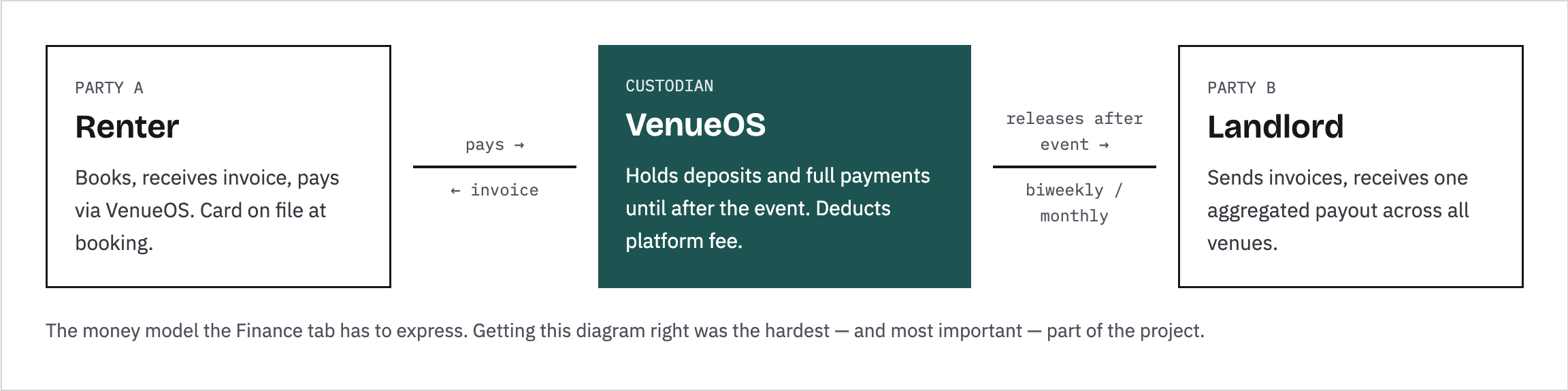
VenueOS is a two-sided marketplace: landlords list event spaces, renters book them, and the platform acts as the payment rail. Landlords invoice renters, renters pay through the platform, and the platform releases the money to the landlord only after the event happens or a cancellation is confirmed.
That custody model protects everyone — it's what lets the platform answer chargebacks and damage claims — but it creates a long, invisible gap between earning money and receiving it. A deposit paid in April for an October event is real, contractual revenue that won't land for six months. The Finance tab's job is to make that gap legible.
02 Research
What five marketplaces already know
I started with desk research: how established marketplaces explain money that sits between buyer and seller. The goal wasn't to copy a layout but to find the mental model sellers already carry into a new platform.
Honest scope: this phase was competitive analysis and persona-driven design. No primary landlord interviews or usability tests yet — those are in the validation plan below.
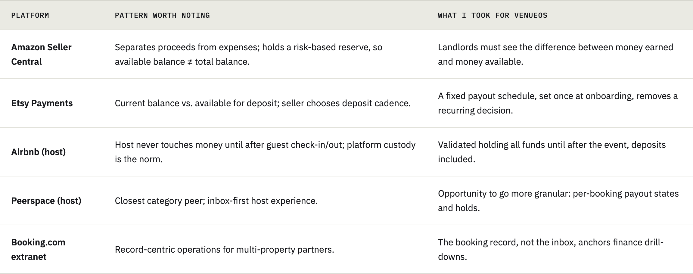

Every platform answers the same five questions. This platform adds a sixth that retail marketplaces don't face: money tied to a future event date, sometimes months away.
03 Who it’s for
Designing for the hardest case
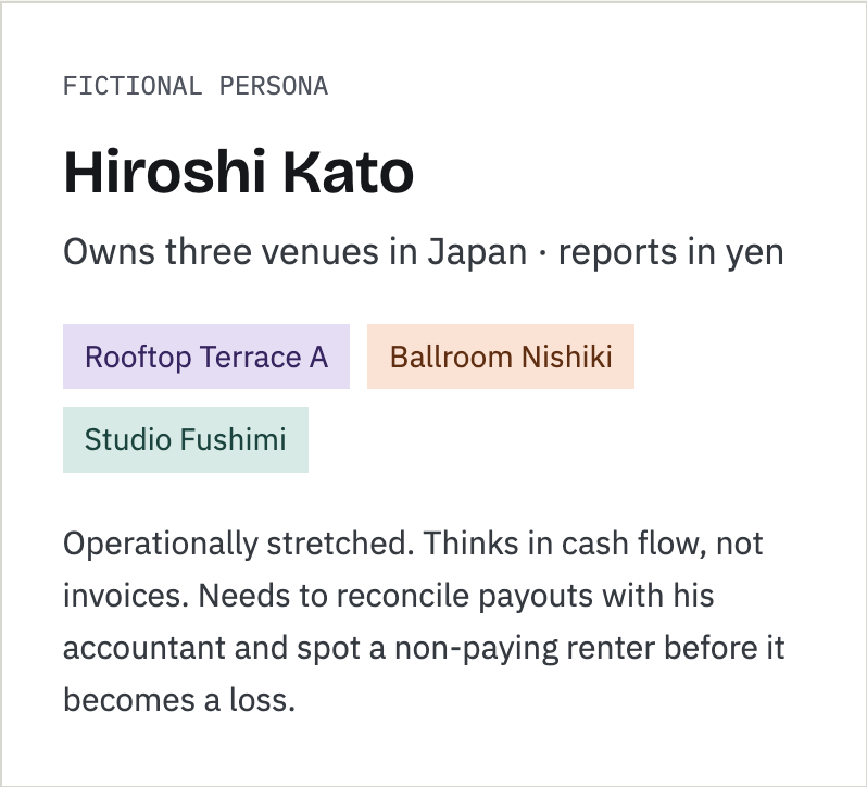
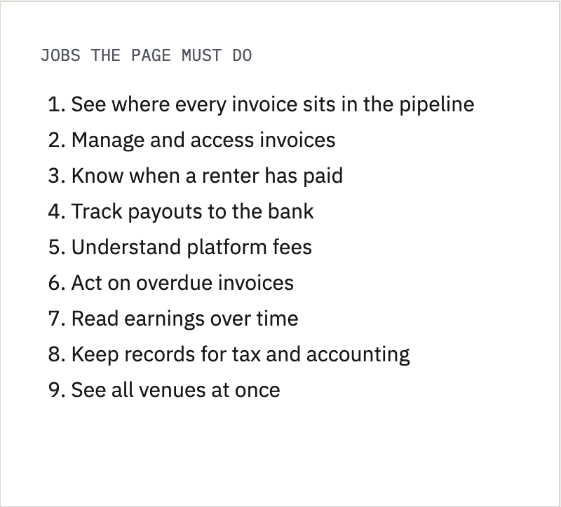
I designed for a multi-venue landlord on purpose: if the page works for three venues, overlapping events and mixed payment states, it works for one.
04 Iterations
Fourteen versions, six decisions that mattered
01
Define the job
Why it matters: scoping what a page doesn't do is a strategy decision before it's a design one.
02
Model correction
03
Trust
04
Self- audit
06
Noise reduction
Most versions were refinements. These are the moments where the thinking changed — including two where I had the model wrong and had to say so.
Finance is a ledger, not a workbench
Invoices are created on each booking's detail page, where the context lives. So Finance became a place to track money, not create it. That one decision removed an entire class of forms from the page.
Who invoices whom?
Early versions modeled invoices flowing from landlord to platform. Wrong: landlords invoice renters, and the platform is only the rail. Fixing it meant rebuilding the status pipeline around who owes what at each step.
Why it matters: scoping what a page doesn't do is a strategy decision before it's a design one.
Show the fee. Every time.
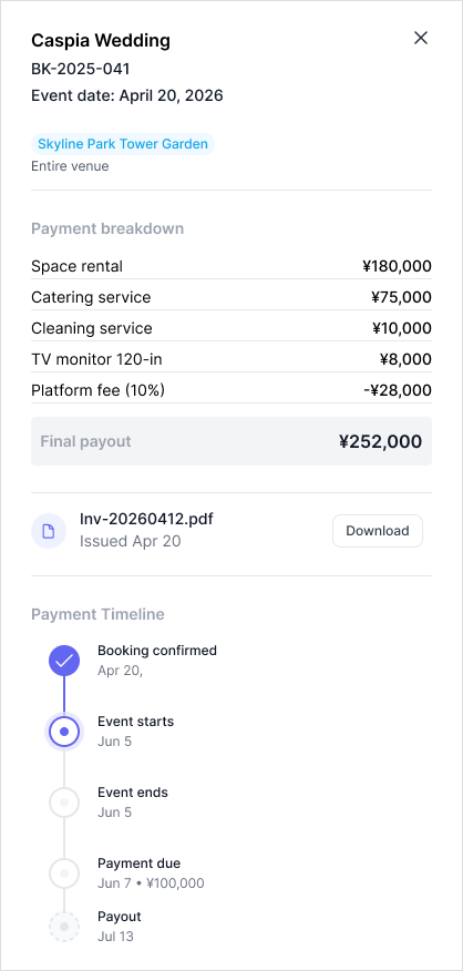
A single "amount" column hides the most emotionally loaded number on the page. I split it into Gross / Platform fee / Net so the landlord never has to reverse-engineer a deduction. For overdue invoices, I added an escalation path to platform support — a modal with a reason and context — instead of a dead-end warning banner.
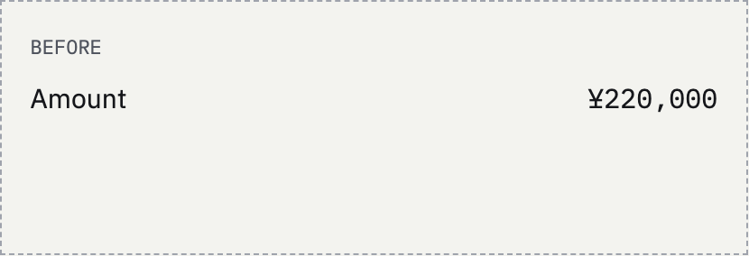
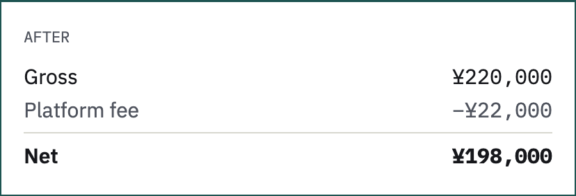
Fee structure (flat, tiered or negotiated) is still an open business decision.
The page tracked invoices — but not payouts
Auditing the mockup against the marketplace benchmarks exposed a gap: it showed what renters owed, not when the landlord gets paid. Once we confirmed the platform holds all funds until after the event, the fix became clear: pre-event states (card authorized, deposit collected) belong on the Bookings page. Payout history only contains bookings whose event has happened.
Why it matters: putting each state where the decision is made shrank the payout status set and made every row in history mean the same thing.
05
Language
"Held funds" → "Upcoming earnings"
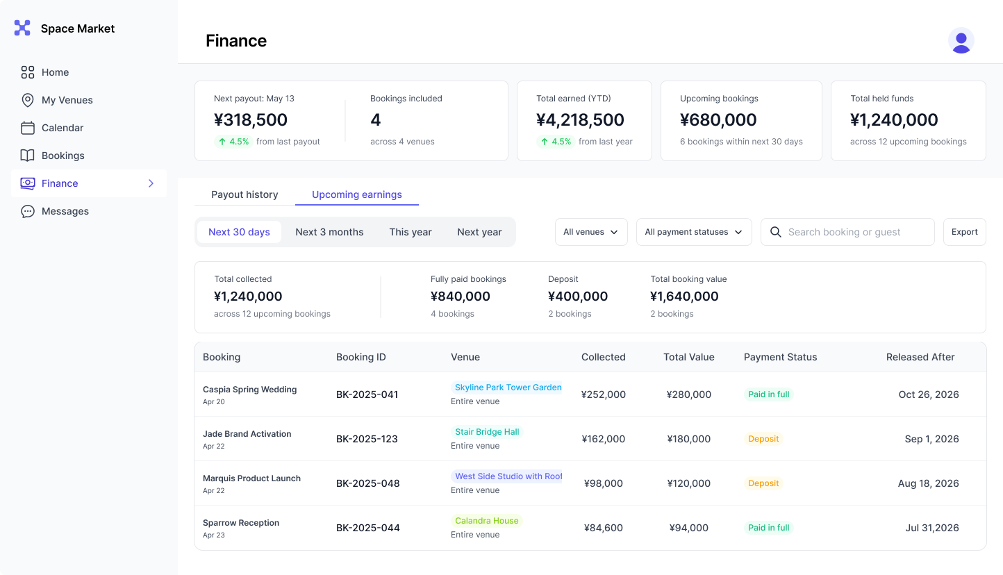
Moving deposits out of history raised a new problem: a landlord with 20 future bookings had nowhere to see that money in aggregate. Option A (booking pages only) forced 20 clicks. Option B — a separate section on Finance — won.
Then the name. "Held funds" is accurate, but it casts the platform as a gatekeeper withholding money. "Upcoming earnings" says the same thing from the landlord's side: this is yours, and it's coming. The platform reads as custodian, not obstacle.
Fewer pills, more meaning
Status pills on every booking row inside every payout turned the table into confetti. I kept pills at the payout level and replaced booking-level pills with inline notes that appear only for exceptions. The invoice moved into a side panel with Payout and Invoice tabs, so drilling in never loses your place in history.
Copy got the same scrutiny: damage-claim language was rewritten so it's clear the landlord files a claim — directionality matters whenever money is pending.
05 The design
Answer first, detail on demand
Payout history
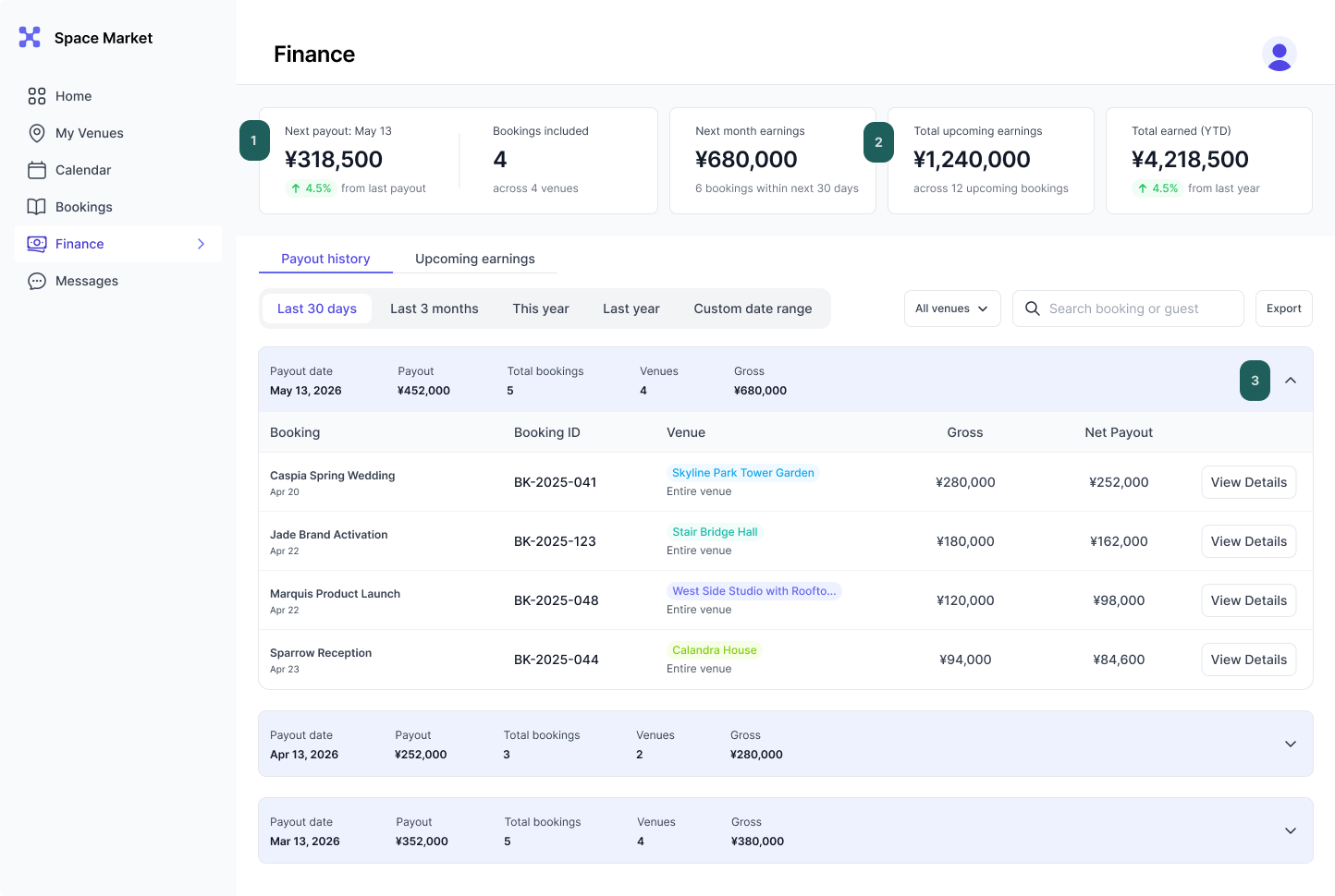
The page is ordered by the questions a landlord asks, in the order they ask them, organized by payout history and upcoming earnings. Numbered callouts map to the reasoning below.
Upcoming earnings
01 Payout banner first
"When do I get paid?" is the first question, so it's the first thing on the page. One aggregated payout, on a schedule set at onboarding.
02 Dynamic summary
Core cards always show: next month earnings, total upcoming earnings, total earned YTD.
03 Expandable history
Payouts expand into bookings; exceptions surface as inline notes; invoices open in a side panel without leaving the list.
06 Strategy layer
Principles that now govern the whole portal
The Finance work produced rules that carried into Bookings, Booking Details and the Dashboard — the part of the project I'd point to as UX strategy rather than screen design.
Model before pixels
Both major corrections were money-flow errors, not visual ones. Map who pays whom, and when, before designing a table.
Custodian, not gatekeeper
When the platform holds someone's money, every label should describe it from their side.
States live where decisions live
Pre-event money belongs to Bookings; post-event money belongs to Finance. Each surface owns one phase.
Benchmarks inform, not dictate
Borrow the mental models sellers already know; diverge where event-dated money makes VenueOS different.
Directional copy
Pending and overdue states must say who owes what. Completed states can imply it.
07 Next
Validation plan
What I'd run before build, to replace persona assumptions with evidence.
Landlord interviews with multi-venue operators: how they reconcile payouts today, and what "held" money means to them.
Task-based usability test on the prototype:
"When is your next payout, and what's in it?"
"Why is this payout less than the booking total?"
"A renter hasn't paid. What do you do?"
Label test: "Upcoming earnings" vs. alternatives, measuring comprehension of when money arrives.
Resolve with the business: platform fee structure — flat, tiered or negotiated — which changes how fees should be explained.
08 Reflection
If I started again, I'd draw the money-flow diagram on day one. Two of my six key decisions were corrections to a model I'd assumed instead of mapped.
That's the lesson I bring to my next project: the most expensive UX mistakes are rarely visual. They're wrong assumptions about how the business actually works, baked into the interface.