
Case Study 01
Urgency is the sort order.
Designing the Bookings tab for landlords running multiple spaces within a venue, where requests expire, half-venue bookings can collide, and the wrong click creates a double-booking.
Role
Product owner & designer
Scope
Bookings tab: state model, IA, interactions, copy
Timeline
April 2026
Status
Concept, pre-launch
The problem
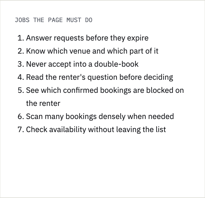
A booking list sorted by date hides what matters most: which request expires first, which one would double-book a space, and which renter is waiting on an answer. For a landlord with multiple spaces and venues, that's a lost booking or a broken promise.
My approach
Defined the state model before the card: what "pending" actually means, how subspace conflicts escalate, and when money belongs on the card at all. The UI became a renderer for those states.
The results
An urgency-first triage view with seven pending states, a four-step conflict ladder that blocks double-booking, and a message drawer that keeps the decision in context. Next: validate with real landlords.
01 Context
Why a booking list isn’t enough
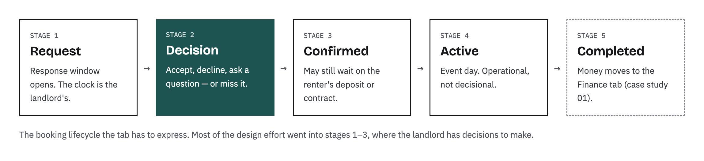
Renters book event spaces in two modes: Instant Book and Request to Book. Requests carry a response window.
Two things make this harder than a typical reservations list. Venues can be booked in parts, a subspace such as half a ballroom, so two requests for the same date may or may not collide. And the platform holds the renter's money until after the event, so a "confirmed" booking can still be waiting on a deposit or a signed contract. The Bookings tab has to turn all of that into one answer: what should I do first?
02 Research
Inbox-first vs. record first
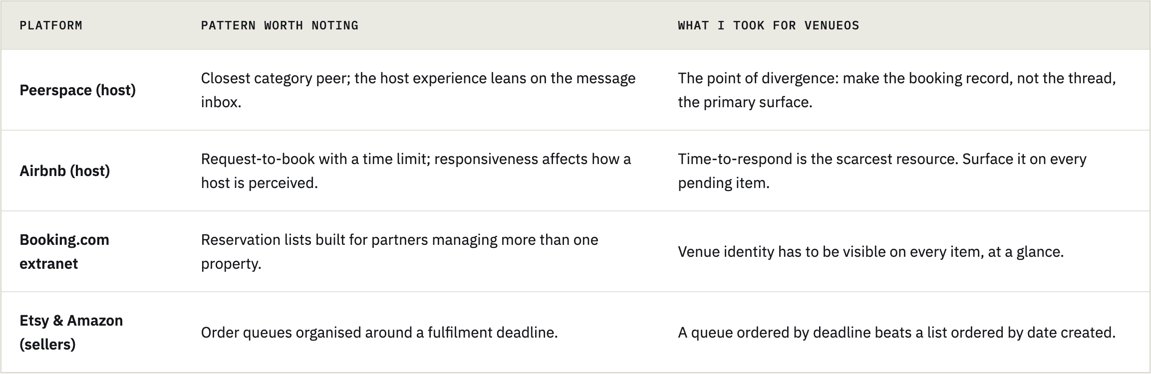
I looked at how hosts and sellers on established marketplaces work through incoming demand. The split that mattered most: some platforms organize the host's day around conversations, others around records. For a landlord with three venues, conversations don't scale.
Honest scope: this phase was competitive analysis and persona-driven design. No primary landlord interviews or usability tests yet — those are in the validation plan below.
Synthesis - The question behind the page
“What needs me, in what order, and can I act on it safely?
Every platform answers the first two parts. This platform has to answer the third, because subspace booking means accepting one request can silently break another.
03 Who it’s for
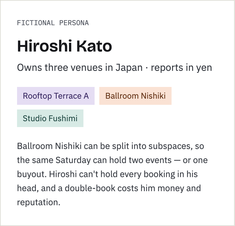
The morning check-in
The design moment I optimized for: a landlord opening Bookings first thing in the morning with a few minutes to clear what needs them.
04 Iterations
Decisions that shaped the tab
01
Default behavior
Why it matters: a default is a product opinion. Most users never change it, so it should encode the job, not a neutral ordering.
02
Error prevention
03
Density
The tab went through many mockup rounds. These are the points where the thinking changed
One control, urgency by default
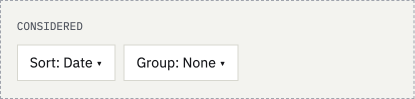
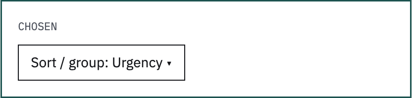
The question was whether to add sort and group-by. Two controls side by side create a decision every visit. I merged them into one "Sort / group" menu — urgency, date, value, group by venue — with urgency as the default. The page opens with the most time-sensitive request on top, every time.
Warn, don’t block
Subspaces mean two requests for the same Saturday may overlap. I mapped four conflict states into a severity ladder.
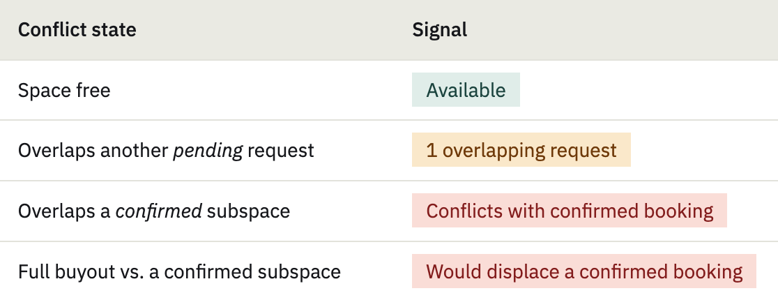
Why it matters: Landlords need all the information before making a decision to confirm bookings.
Cards for triage, a table for comparison
Cards are the default because triage means reading one booking at a time. But a landlord reconciling a busy month needs to scan across rows. The table toggle had one rule: every column earns its place.
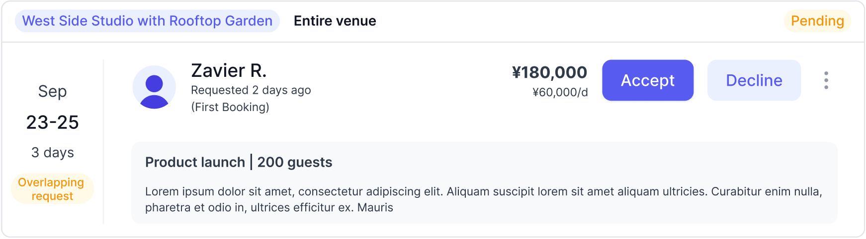
Why it matters: the urgency treatment carries over from card to row, so switching views never changes what "urgent" looks like.
05 The design
Urgency -sorted booking list
Default card view and table view. Numbered callouts map to the side notes.
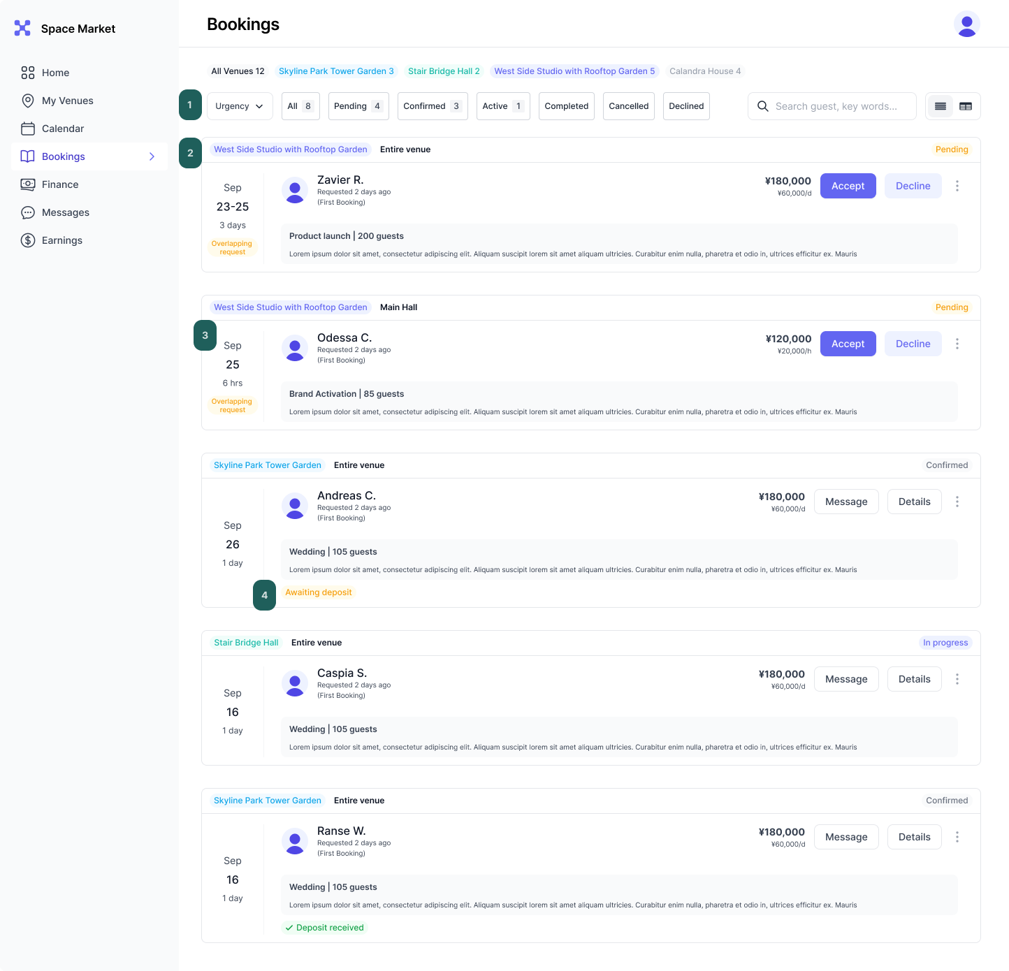
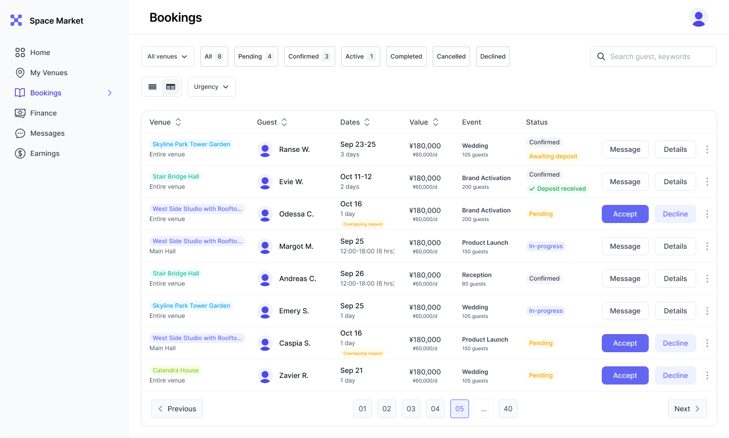
01 One control
Venue filter, a single sort/group menu defaulting to urgency, and the card/table toggle. Filters combine with status tabs.
02 Most urgent first
Venue badge on top, then renter, event and the urgency pill.
03 Safe by design
Subspace chip shows the name and fraction of the venue.
04 Only actionable money
Confirmed cards show deposit status only when it needs attention, with copy that says who owes it.
06 Strategy layer
Rules that outlived the screen
Bookings was where several portal-wide conventions were first set. The Dashboard, Calendar and Booking Details pages were later built on them.
States before screens
Define every state a record can be in, then design the component that renders them. The card is the last thing you draw.
Show only what implies action
If a status doesn't change what the user does, it belongs one level deeper.
Color guides venues
Each venue is defined by its color for easy recognition.
Context travels to the decision
Bring the message, summary and actions to the record — never make the user leave the list to decide.
Block irreversible mistakes
Warn on recoverable risk. Disable on irreversible harm — and always explain how to resolve it.
Defaults are opinions
Pick the default that encodes the job. Neutral orderings push the work back onto the user.
07 Next
Validation plan
What I'd run before build, to replace persona assumptions with evidence.
Contextual interviews with multi-venue operators: watch a real morning check-in and how they track requests today.
Color comprehension test: do landlords all the colors without being told?
Task-based usability test on the prototype:
"Which request would you handle first, and why?"
"Can you accept Mika's request? What would you do instead?"
"Sarah has asked a question. Answer it and make a decision."
"Which confirmed bookings need something from the renter?"