Your Custom Text Here
Overview
My Roles: Research, UI, Prototyping
Platform: Website, Mobile Responsive
Story
Acne Studios, a Stockholm based fashion house with a multi-disciplinary approach, is a well-respected creator of ready-to-wear, magazines, furniture, books, and exhibitions.
Tools
Keynotopia, Omnigraffle, Photoshop, Marvel App, White Board, Pen and Paper

solution
By categorizing and organizing the navigation through user testing and information architecture, users can navigate through the website more efficiently. I also redesigned for a seamless checkout process.
Problem
Acne Studios' website has problems with navigation and usability. The values and reputation of the Acne Studios were misaligned with the usability of the website. There was also a high bounce rate of users exiting the website.
Discover
C+C Analysis | Card Sorting | User Interview

Competitive Analysis
I began with heuristic evaluations of Acne Studios and competitors. Studying e-commerce best practices, the comparative and competitive analysis allowed me to see what Acne Studios is doing in comparison to its competitors.

card sorting
Given the wide range of categories already on the site, card sorting was needed to reorganize data to inform the navigation schema. This helped inform the newly designed information architecture.
User interview
User interviews and contextual inquiry revealed the current site's navigation to be burdensome. Users did not like the layout and misalignment of items and images. Also, there was some missing information during checkout that prevented a seamless checkout process.
Define
User Persona | User Story | User Flow | Site Map | Navigation Schema

user Persona

User Story / User Flow
I created a User Story to gain insight on our user's usage of the website. In this case, Terry has an outfit picked out for a tech industry event she is attending the following week. She needs a black jacket to top off her look. The User Flow helped break down the user's interaction with the product, separating the different steps for searching and purchasing a leather jacket.

Site Map / Navigation Schema
Site map
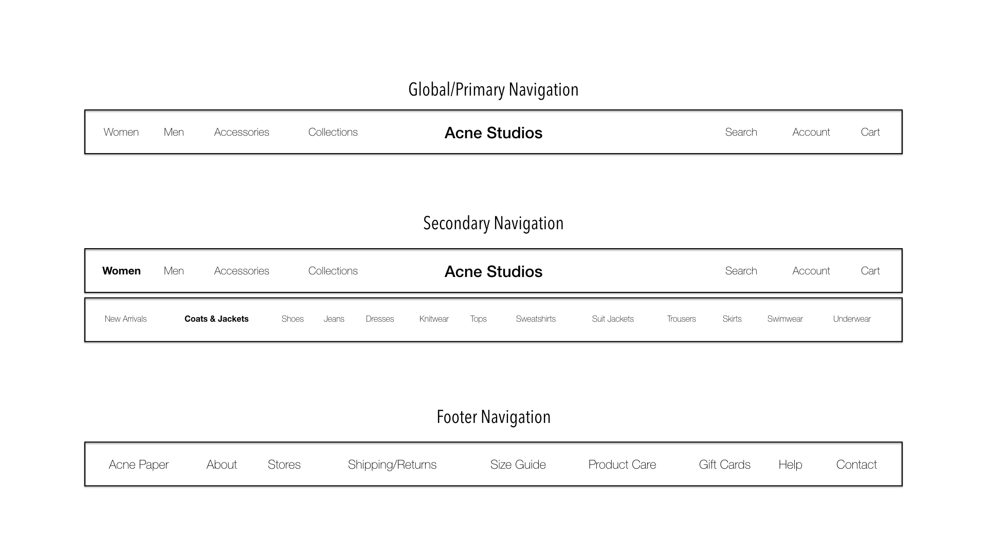
From the results of the card sort, I was able to identity key categories that users would like to have available to them. This helped inform the site map.

Navigation schema
From the site map, I was able to design the navigation schema. I added both primary and secondary navigation to the top of the page. The current website has a side bar navigation.
Design
Design Studio | Sketching | Mock Ups

Design Studio
For the ideation process, I worked with some classmates and participated in a design studio to re-design the homepage for Acne Studios' mobile site. Learning to design mobile first helped simplify the layout and features needed.
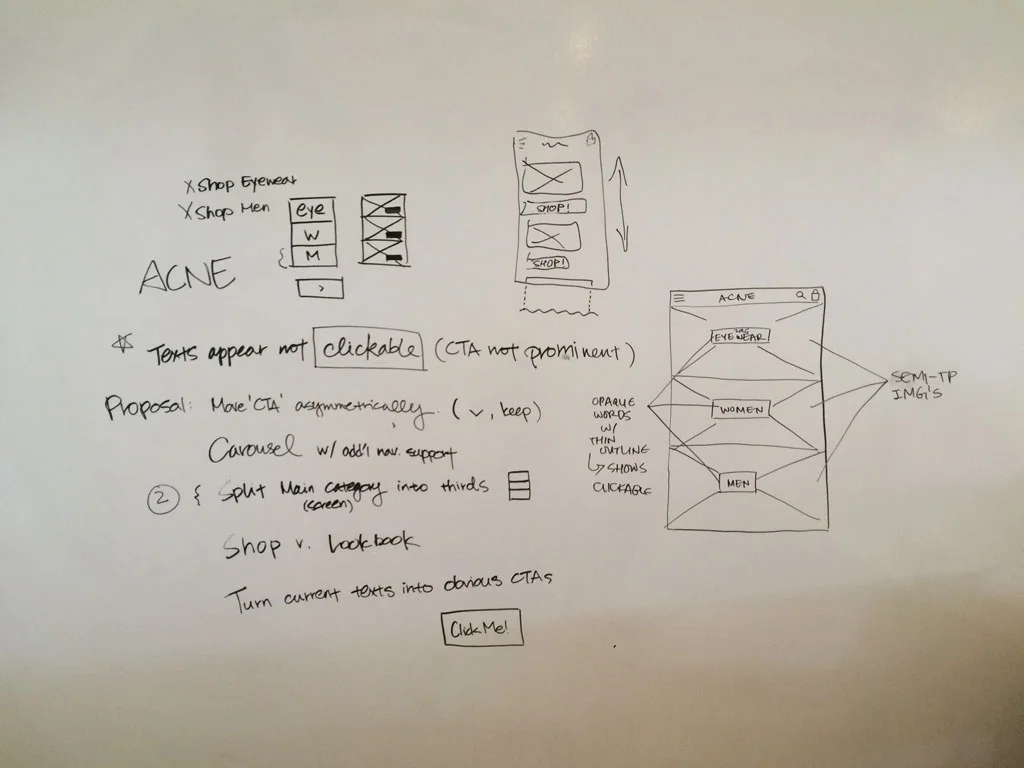
Sketching
mobile first
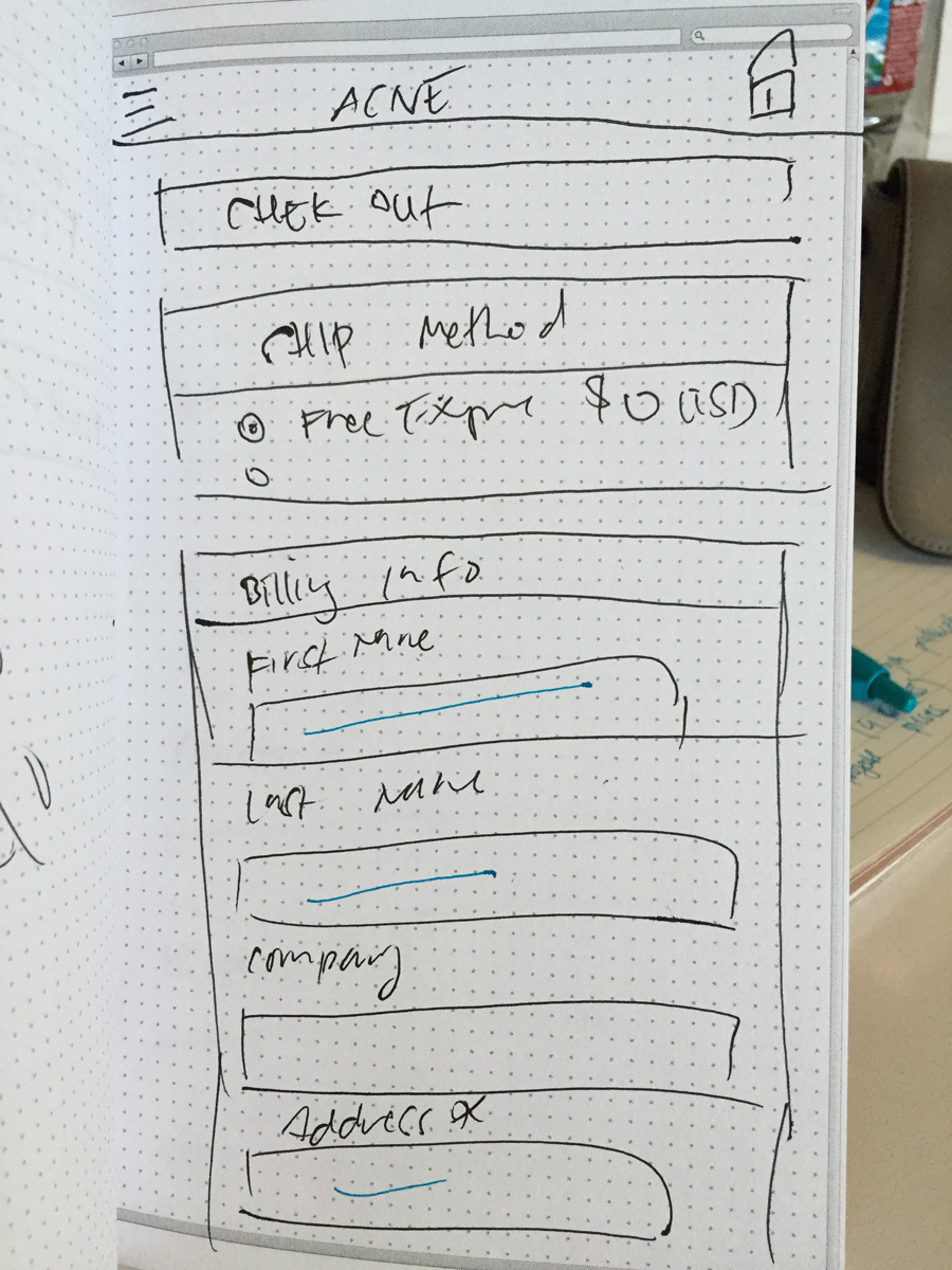
Using best practices, I took the mobile-first approach and sketched out the wireflow on paper. This helped me create a responsive design.


Testing
Usability Test | Prototype

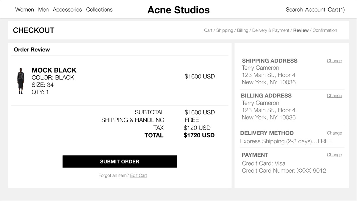
Usability test
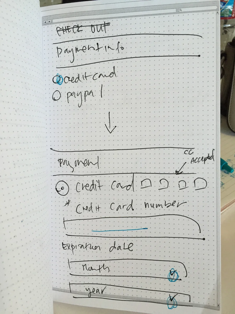
I conducted in-person user testing by asking users to go through the checkout process. The early steps in the checkout process has the CTA on the bottom left. Having the submit button below the order summary on the right was inconvenient for the user. Also, to reduce the number of steps for checkout, the users would be able to complete their order as soon as payment info was entered. However, after testing, users wanted a final review order page before completing the order. I re-iterated to add the final review order page and kept the CTA on the left.